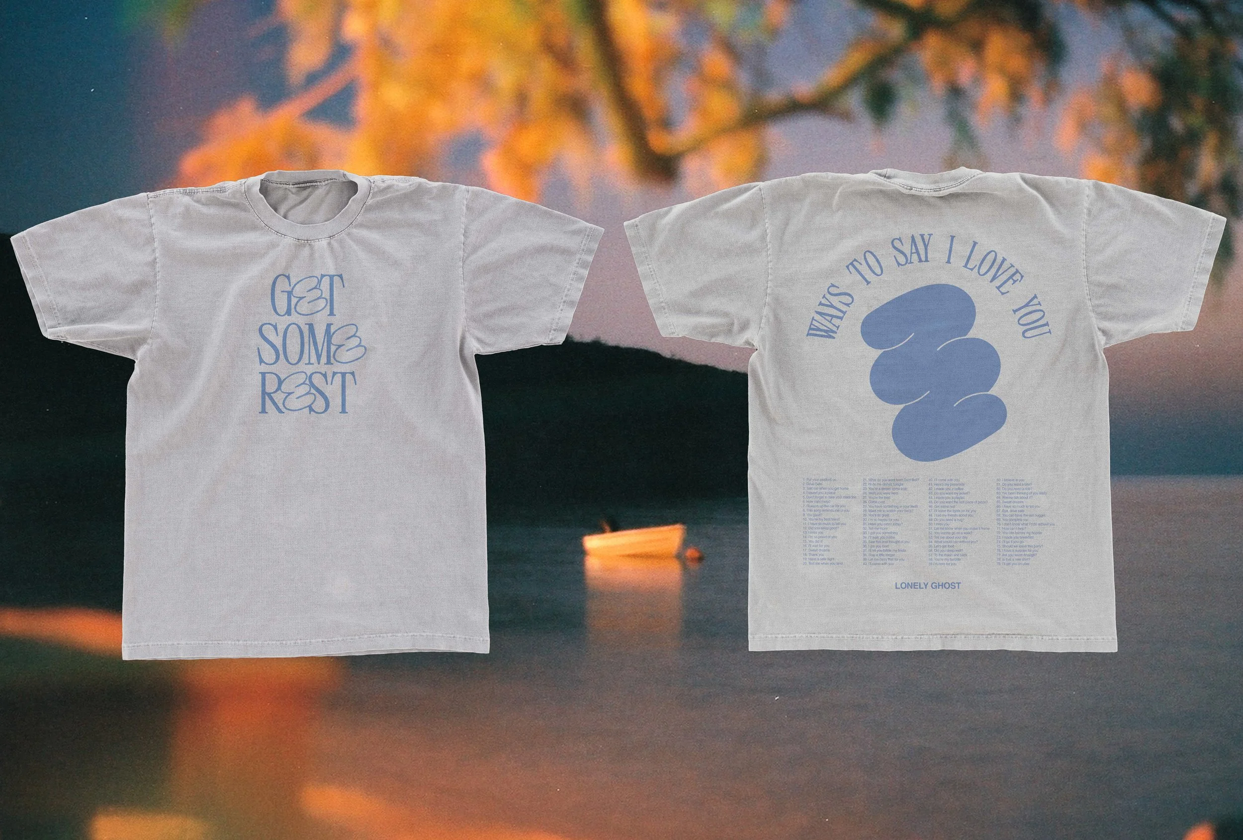
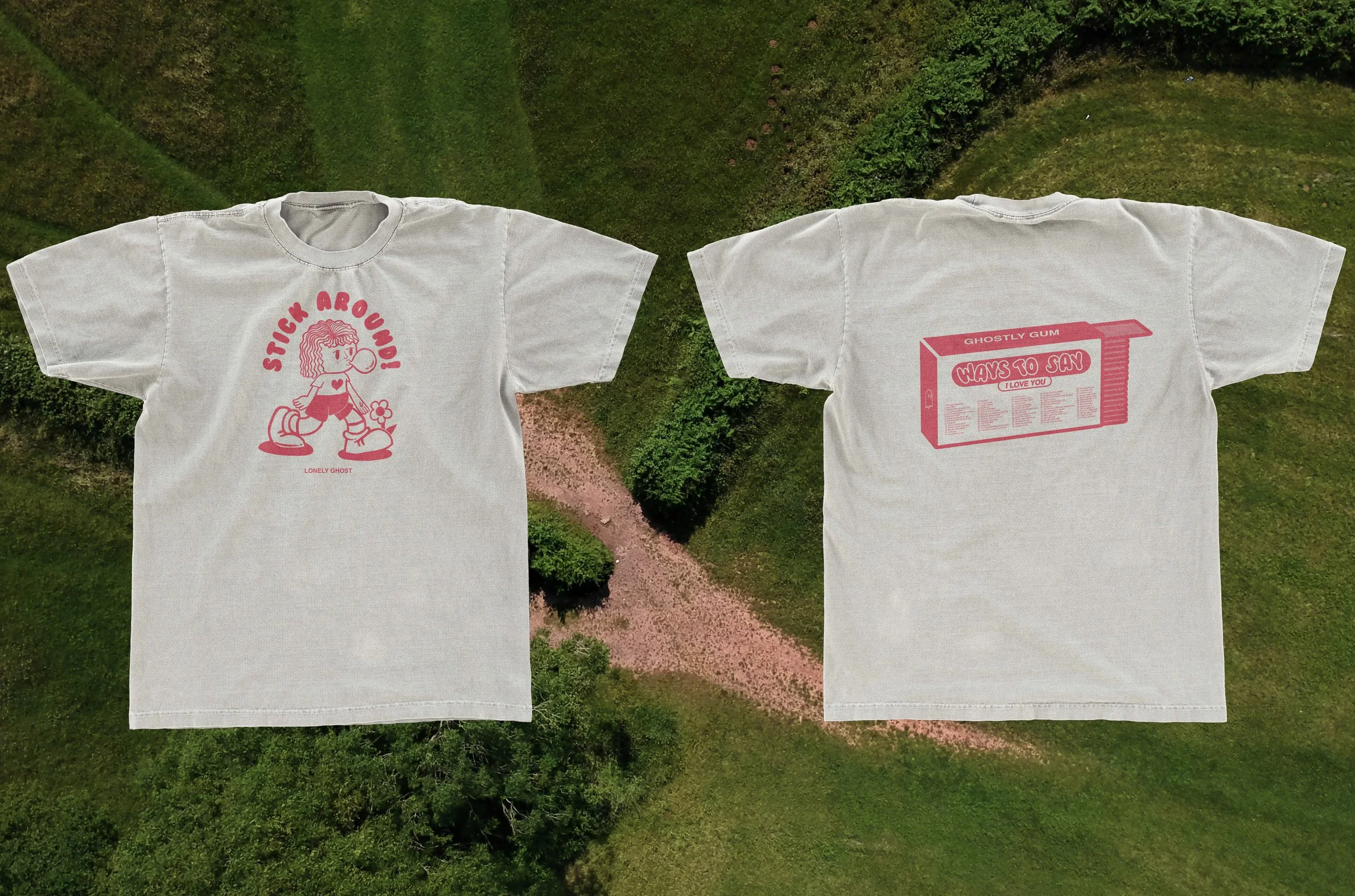
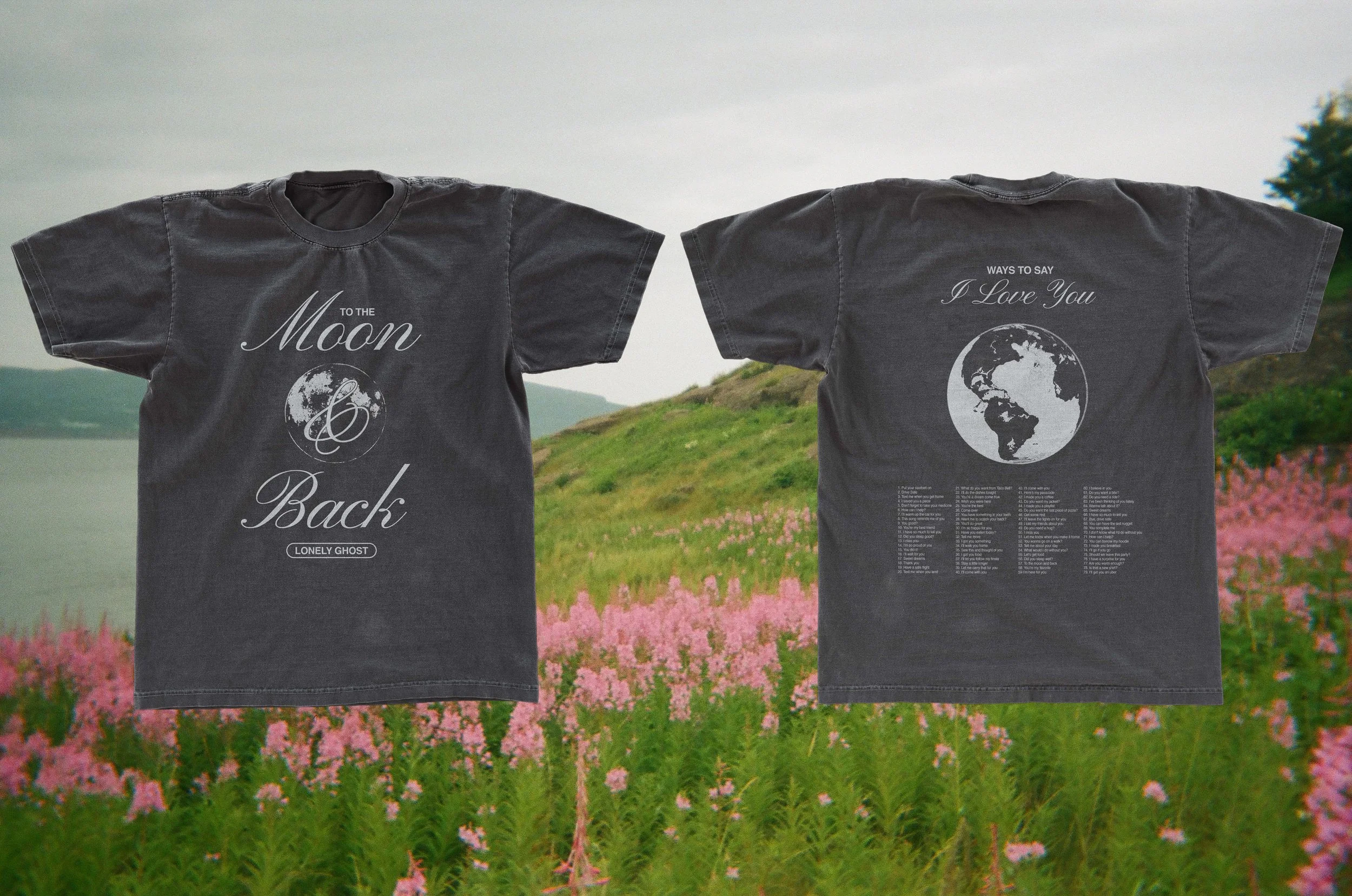
These designs are for a second installation of the brand Lonely Ghost’s WAYS TO SAY I LOVE YOU line. I wanted to have some alignment with the passed designs while also innovating, so I maintained monochromatic colorways and kept them very type heavy.
Get Some Rest is an exploration of contrast. The serif typeface is quite sharp and structured. Mixed with the organic shape/letter elements, the design has a lot of visual interest and quirkiness.
STICK AROUND! Is an illustrative play on words. Inspired by retro illustration styles and recent trends in naive/drawn type.
To The Moon & Back intention was luxury cool. The typography is classical, but the composition feels new and interesting. I think the colors for this one will also be integral in communicating the full vision.
Wish You Were Here was inspired by a definition of retro-futurism that I heard: the feeling of being nostalgic for futures that didn’t happen. These graphics are visually proximate to early-computer graphics, but explore slight variations that could have existed in another version of our past/future.


